ATM simulator Programming user interfaces
For my final project for the course: Programming User Interfaces, I built an ATM Simulator. Cha-Ching! Why an ATM? Because, we all use it. It's essential. Yet, it is not the most simple device to use. People make all sorts of errors while interacting with the ATM. I wanted to build a new ATM interface that is more user friendly and reduces error.
Before beginning the project, I looked up ATM simulators online and made a list of the bunch of features they provide. I also visited the ATM machines to check how they function and what I'd like to change about them. I realized that one thing I definitely need to fix is the complexity of the interface and the lack of user freedom.

For this project, I followed the "Iterative" prototyping process. I started off by making very low fidelity paper prototypes. I made these on small 5X3 cards and tested them with real users. Testing involved bringing my prototypes to users and having them use it, while thinking aloud as they perform a task on the interface. I tested my paper prototypes with two grad students from CMU and UPitt respectively. I first conducted a background interview with them that involved questions about their technical capabilities and their ATM usage. I gave them a bunch of oral instructions which included what their PIN is and what the ATM does. Their task was to withdraw $50 from the ATM, change their PIN from 1234 to 2345 and to check their mini-statement. While they performed the tasks, I changed various affordances on the interface to show them the output display of their input.

What I learnt from the paper prototype evaluation: As the users thought aloud, they got stuck in places and/or reported things they could not understand. Additionally they also made some errors. The users got confused about the placement of text in some screens. They couldn't understand what they were supposed to do next. They got confused with the function of some buttons, like "Enter". I recorded these in the User Action Reports (UARs) and noted what Heuristic principle the interface is violating by giving evidence and how it can be fixed. Based on these UARs, in the next round of prototypes, I changed the layout of the page to make it clearer and renamed the button labels. Paper prototyping is a quick and inexpensive prototyping method and makes for easy testing. I could quickly identify simple usability errors and fix them without spending a lot of time and money on development. However, paper prototypes sometimes cannot convey the true picture. The user got confused about the layout and distinctions that could have been more clear in a higher fidelity prototype. However, for identifying some basic errors, it was great.
The next round of prototypes were the low-fidelity Keynote prototypes. These were interface mock-ups that were not exactly functional but provided a simple click-through navigation that the user can interact with. I wanted to use Keynote for building low-fi mock-ups because I wanted to try out a bunch of navigation click through features that Keynote provides. I learnt the mistakes from the paper prototypes and made changes in these low-fidelity prototypes. As with the paper prototypes, I tested these with users to find usability errors.
I conducted two rounds of user evaluations using the Think-Aloud evaluation technique. This time the users included a middle-aged woman, an artist and two students. The problems I observed ranged from confusion about what the cash buttons did to mini-statement viewing preferences. Based on the break-points observed in these evaluations, I prepared User Action Reports for each usability issue. In these UARs, I recorded the evidence of the issue, the Heuristic principle the interface was violating and how it can be fixed. I made changes in each round of low fidelity Keynote prototypes and made a new round of prototypes. In all, I made three iterations of low-fi prototypes.
Low-fi prototypes are very quick to make. I could also fix them with changes in subsequent rounds in very little time. They were great to test as the user could click through the interfaces and the interface was providing them with feedback. They were a very close clone of the high-fidelity prototypes, only lacking some functionality and having no back-end to store data. Usability evaluation with low-fi mock-ups was very fruitful and by the third iteration, I had a very strong prototype ready to move on to the high-fidelity functional prototype.
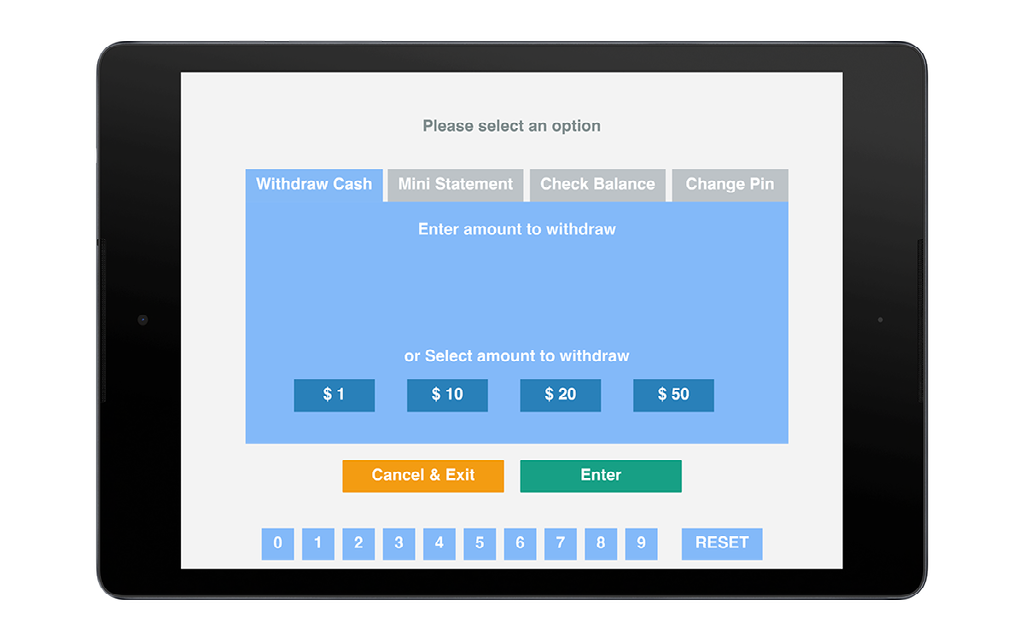
For my high fidelity functional prototypes, I used the tool FramerJS. I used FramerJS because I wanted to add animations and create an interface on the touch screen. I began by turning the last iteration of my low-fidelity prototype to a functional prototype in FramerJS while incorporating all the changes from the UARs collected from the last round of testing. It took me a while to generate these high-fi prototypes since I was learning a new complex tool.
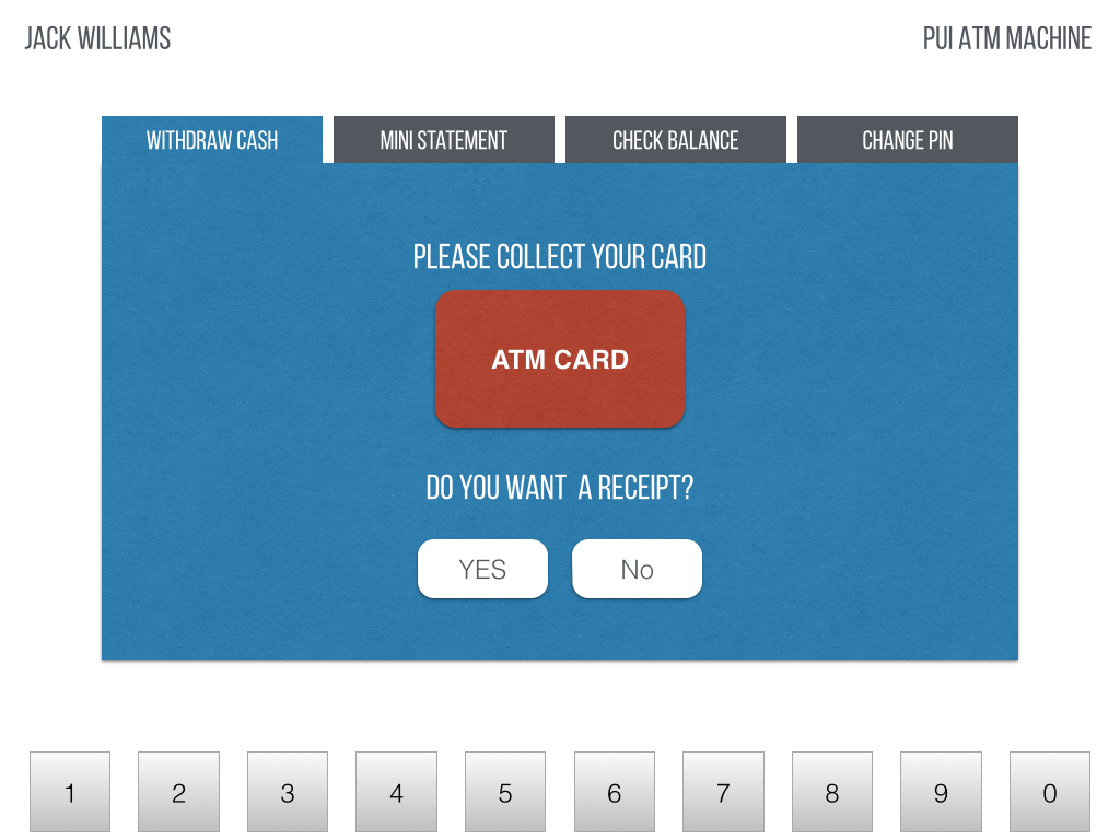
I then conducted an Expert Heuristic Evaluation on these interfaces. I was allotted one of my colleagues who conducted an expert evaluation of the interfaces. Based on the errors they found, they prepared some UARs with recommended changes. These were extremely useful since they suggested changes like the inefficiency of the keypad placement, that I would not have normally figured out. I also tested the prototypes with two real users and identify the breakpoints. Based on the expert evaluation and user evluation, I prepared another iteration of the high-fidelity prototypes. I again conducted a round of user evaluation and prepared UARs based on the breakpoints. In this final testing round, I got to test the prototypes on the tablet with touch screen interactions. Based on these reports, I built the final version of my functional ATM.
I learnt that in the Think Aloud evaluations with users, the problems identified with high-fidelity prototypes were very different than the problems identified with the low-fi prototypes. In the low fidelity mock-ups, the problems were broader, like the basic layout or the navigation or the function of main features. In the high-fi prototypes, it was more fine tuned, like the errors in input and the lack of feedback. The problems identified however, were more difficult to fix as compared to the low-fi prototypes.
This project was a very interesting learning experience about the iterative design process. I learnt evaluating interfaces of different fidelities and incorporating the findings in the next version. I observed how the interface evolved and became more user friendly with each version. I also learnt using FramerJS which is an awesome tool. Throughout designing the interfaces, I kept in mind usability principles and Nielsen's Heuristics. I also got to present the final prototype to the class.
This project was carried out by Safinah Ali. Special gratitude to the course instructor Prof. Dey, the Teaching Assistant Jennifer and the usability evaluation expert Ellise.